The Inn at Langley
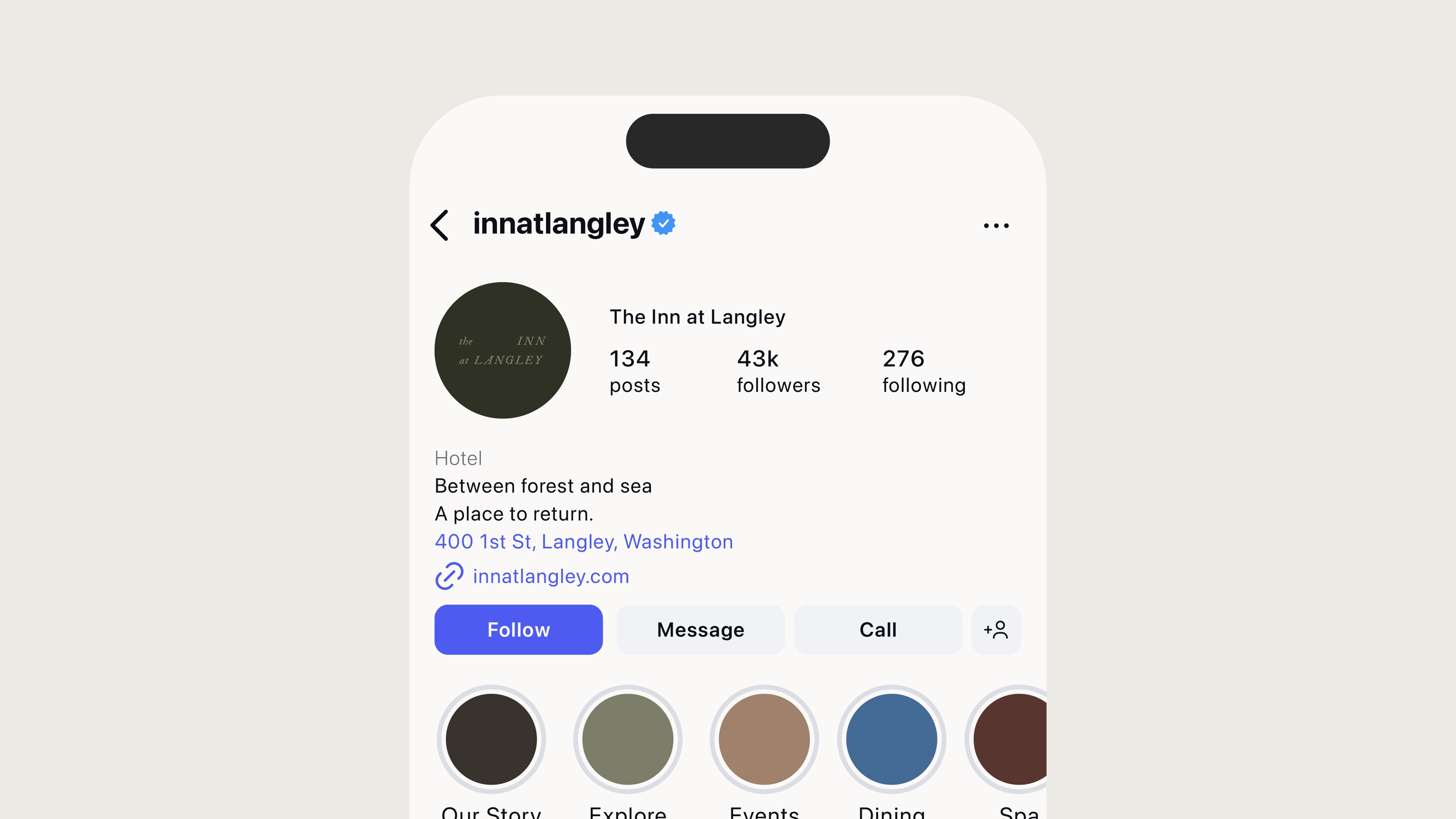
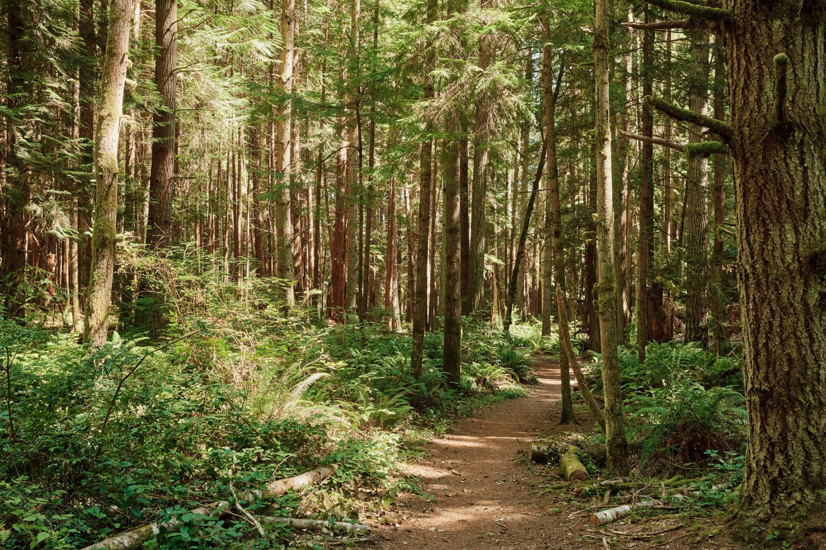
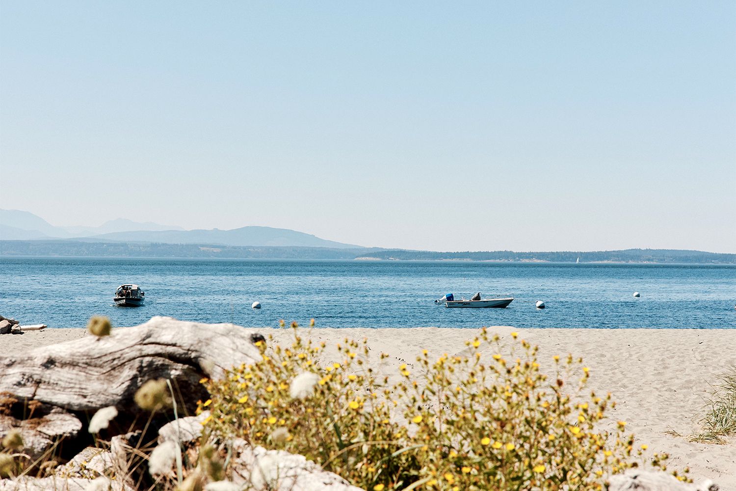
The Inn at Langley is a retreat where time slows and the land leads: a place shaped by forest, sea, and stillness and a brand guided by the solitude of life on the Puget Sound.
Overlooking the Saratoga Passage on Washington’s Whidbey Island, the small property offers an unhurried stay, a world-class spa program, and a new culinary experience by award-winning chef Johnny Spero.
First opened in 1989, the inn reopened in 2026 under Akin Hospitality and was named by Condé Nast Traveler among the world's most exciting hotel openings this summer.
Services
- Brand Identity
- Art Direction
- Copywriting
- Web Design
- Wayfinding
Credits
Brand Creation & Positioning
Long Weekend
Graphic Design
Jackson Kruse
Illustration
Steph Carendi
Photography
Bill Phelps
Zach Sorensen
Aynsley Ramsaur
Teo Crider
Web Development
Second Story
Language
Leigh Patterson
Concept
Foreign National
Primary Mark
Studio Portico
Chef
Johnny Spero
Press
Raluca State
Between Forest and Sea
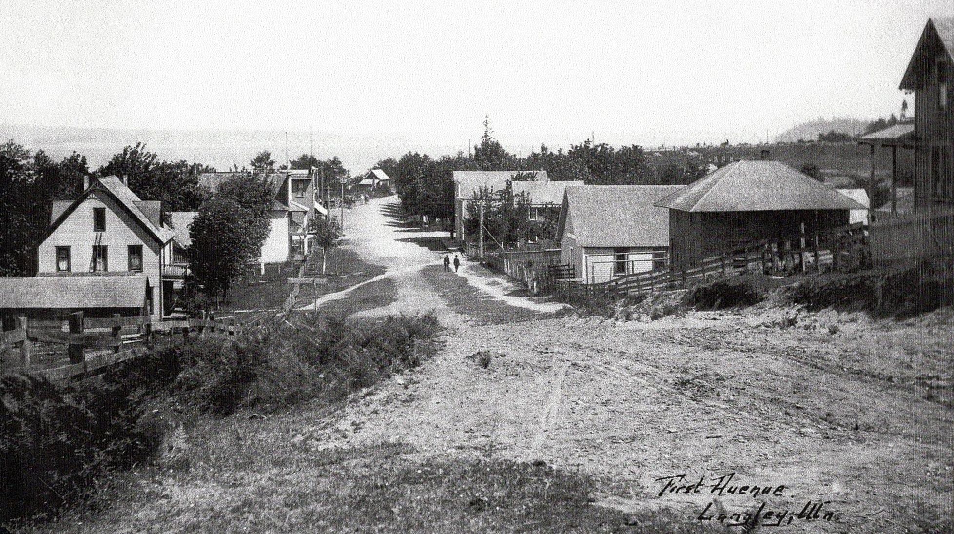
Just over an hour’s travel from Downtown Seattle, Whidbey Island has been shaped by glacial landscapes and generations of native life along the shores of the Saratoga Passage.
The village of Langley emerged in the late 1800s, a quiet harbor community overlooking the Puget Sound.
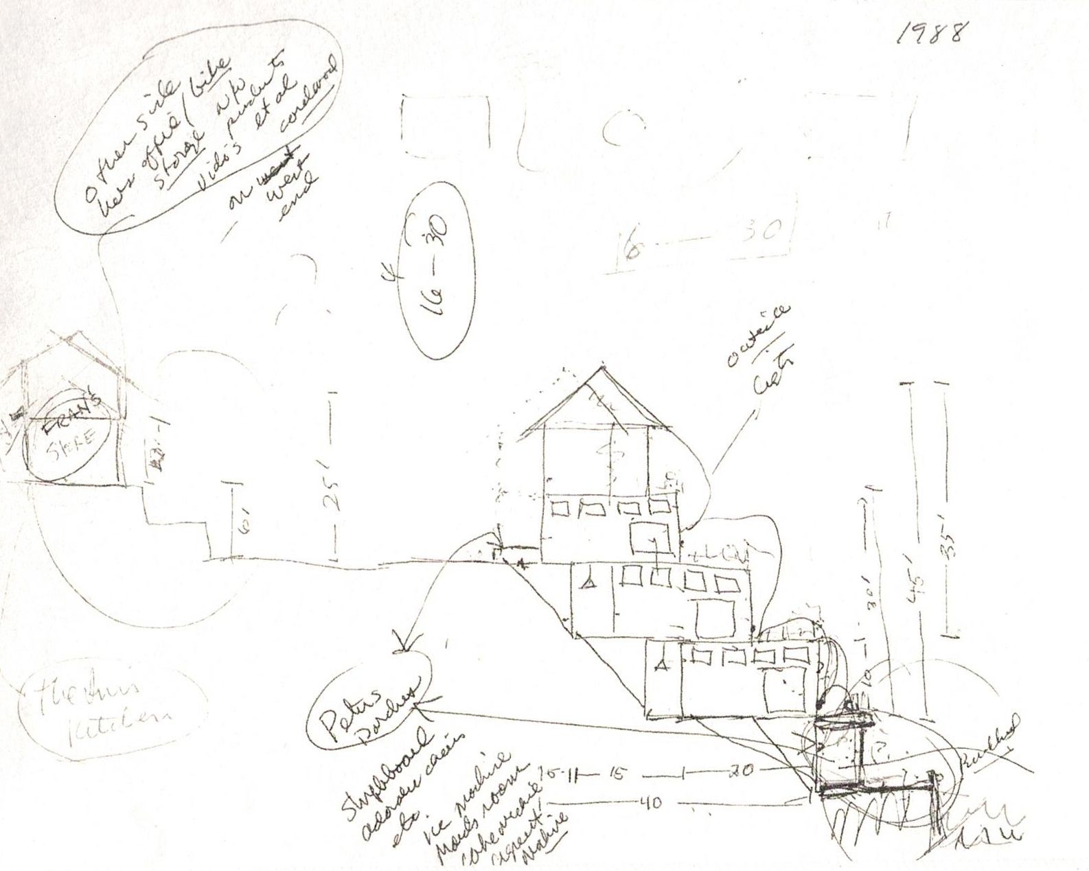
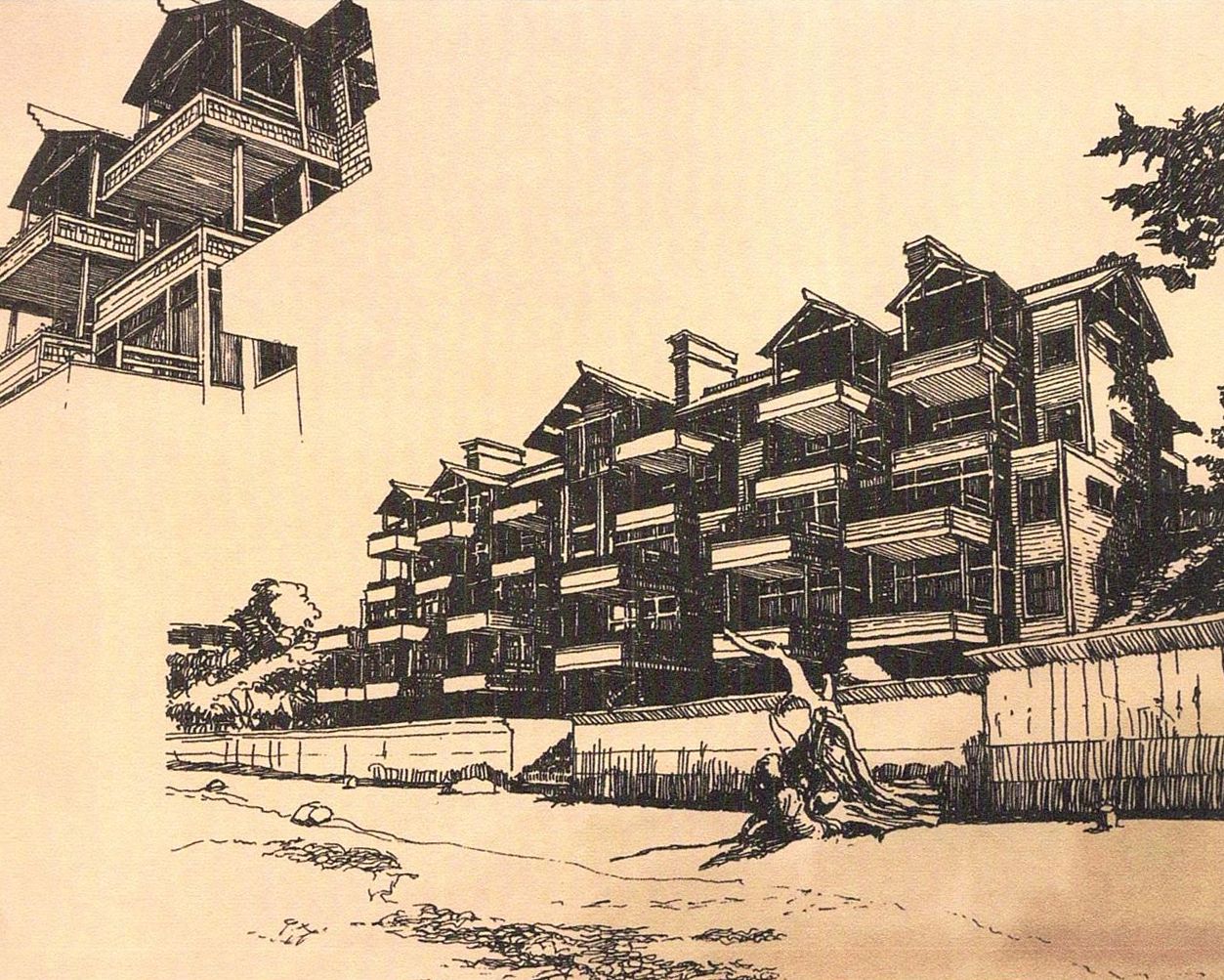
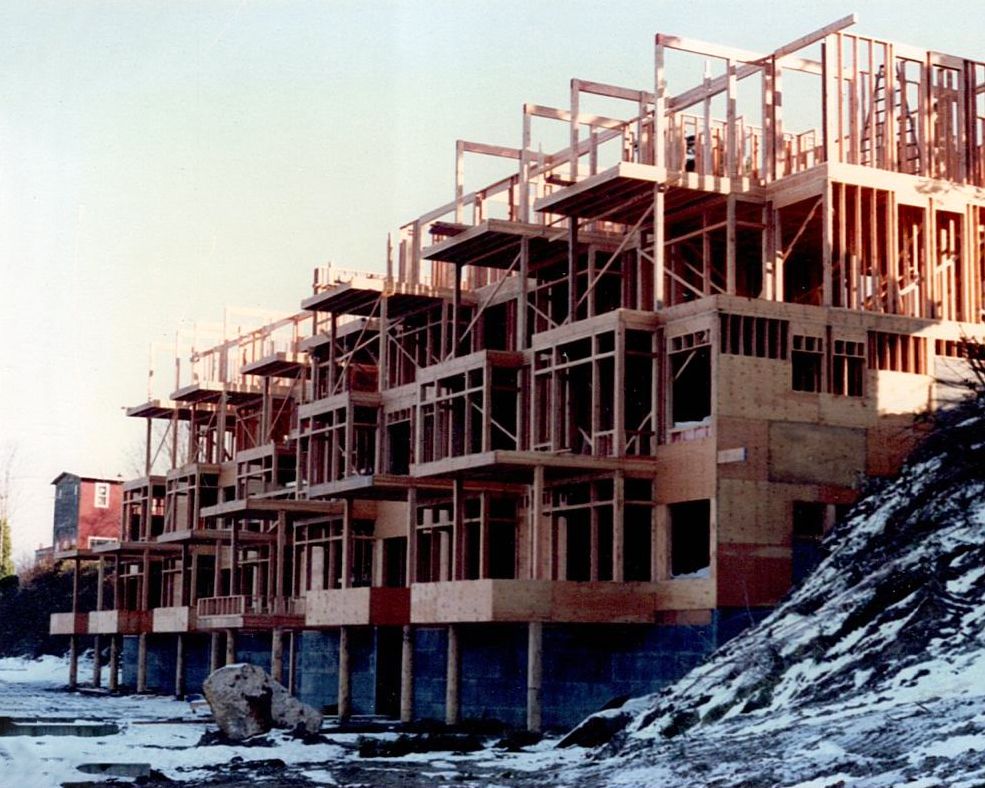
The inn opened in 1989, guided by the vision of Pam and Paul Schell, whose deep connection to the island helped shape the inn’s refined spirit. Both civic leaders active in arts and culture, Paul served as mayor of Seattle from 1998 to 2002.
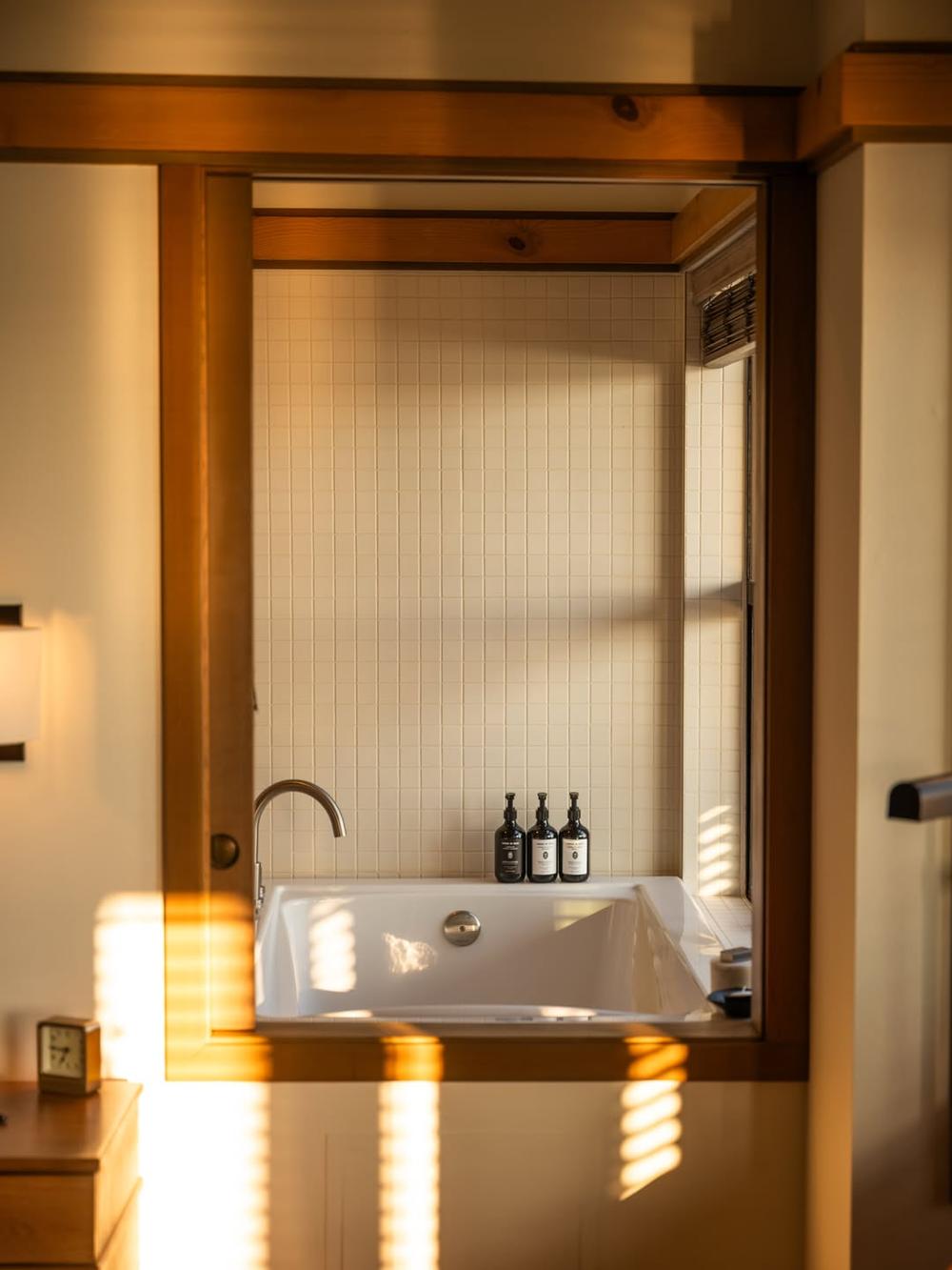
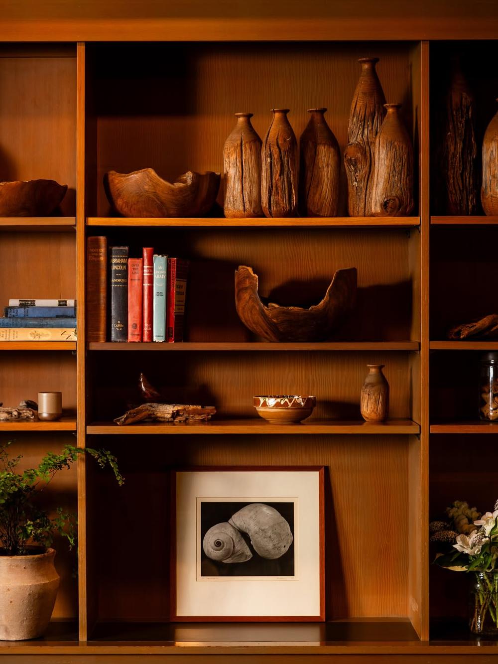
Inspired by the works of Frank Lloyd Wright and the quiet simplicity of Japanese design traditions, the inn blends Pacific Northwest materials, natural light, and expansive water views — a peaceful place to slow down and experience the rhythms of island life.

Logotype
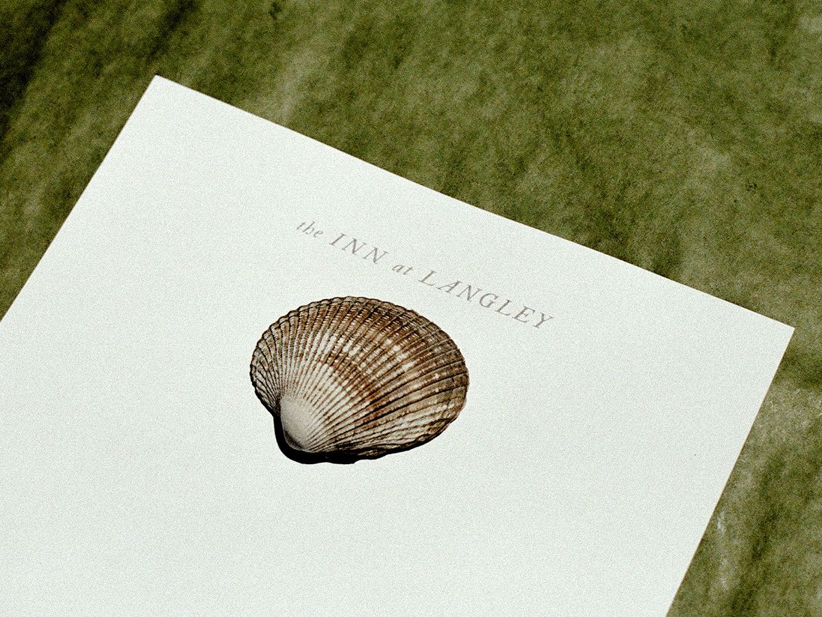
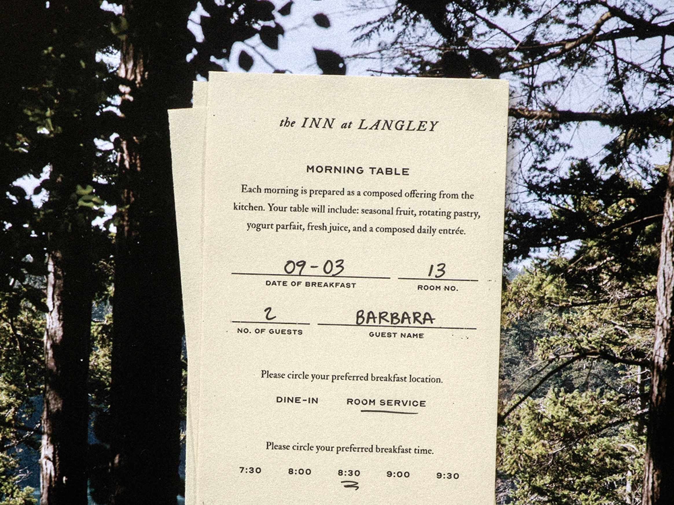
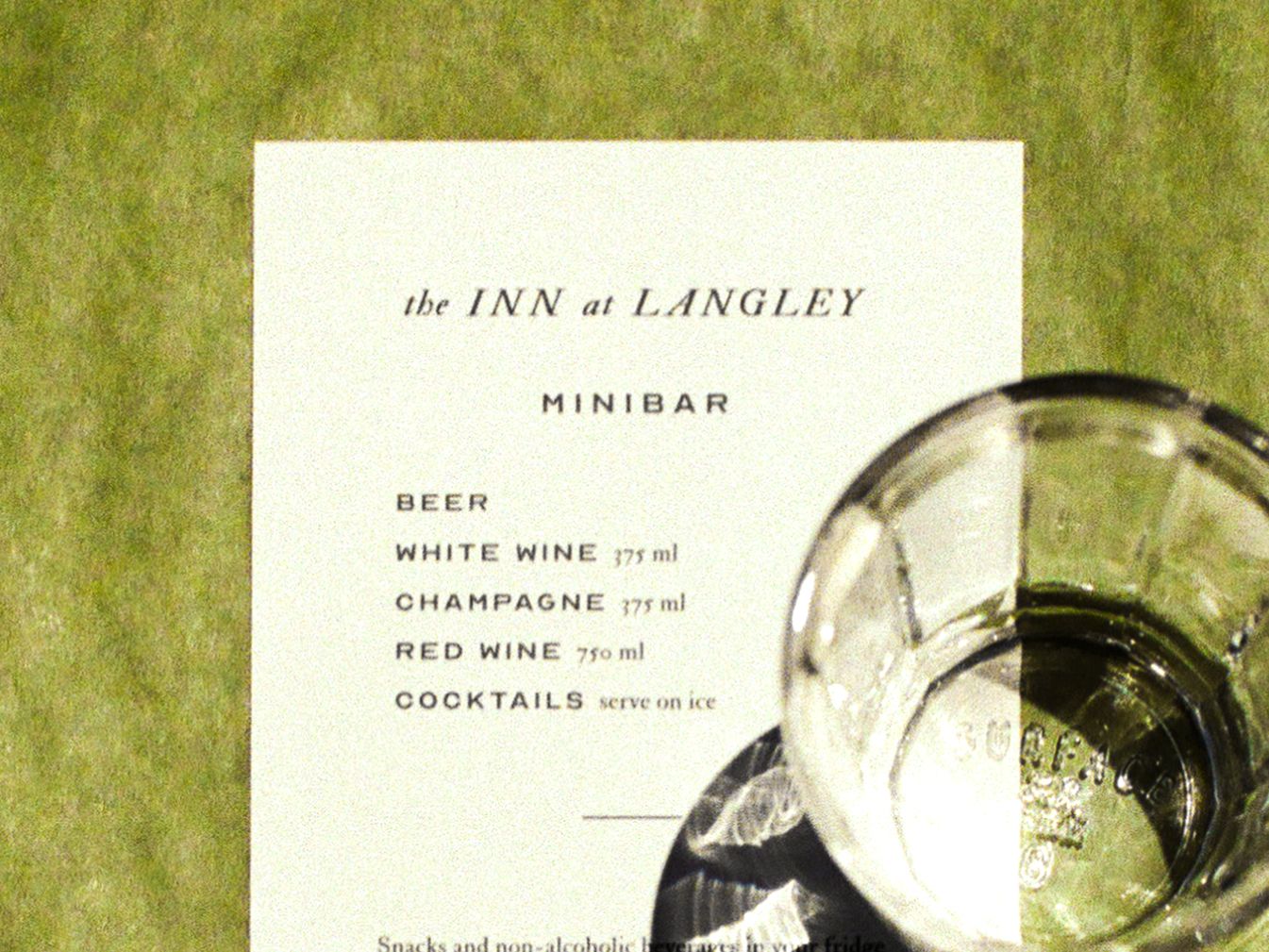
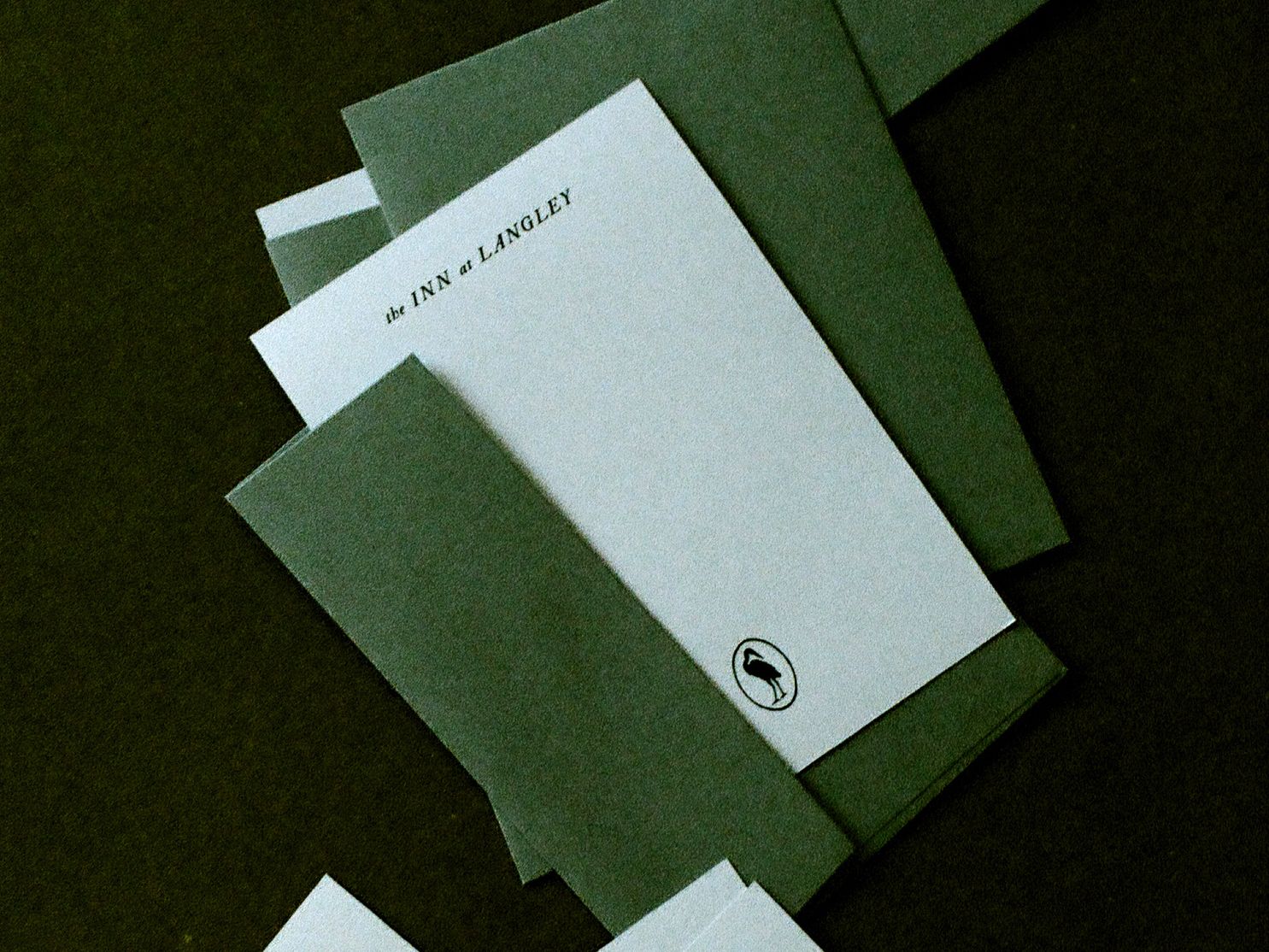
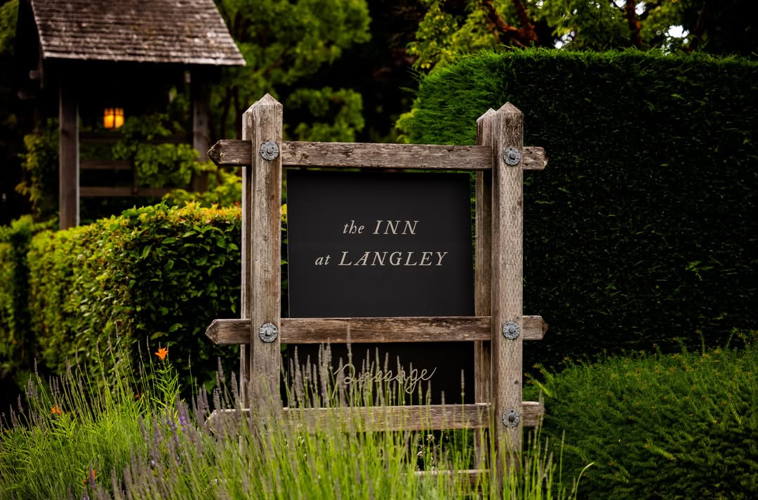
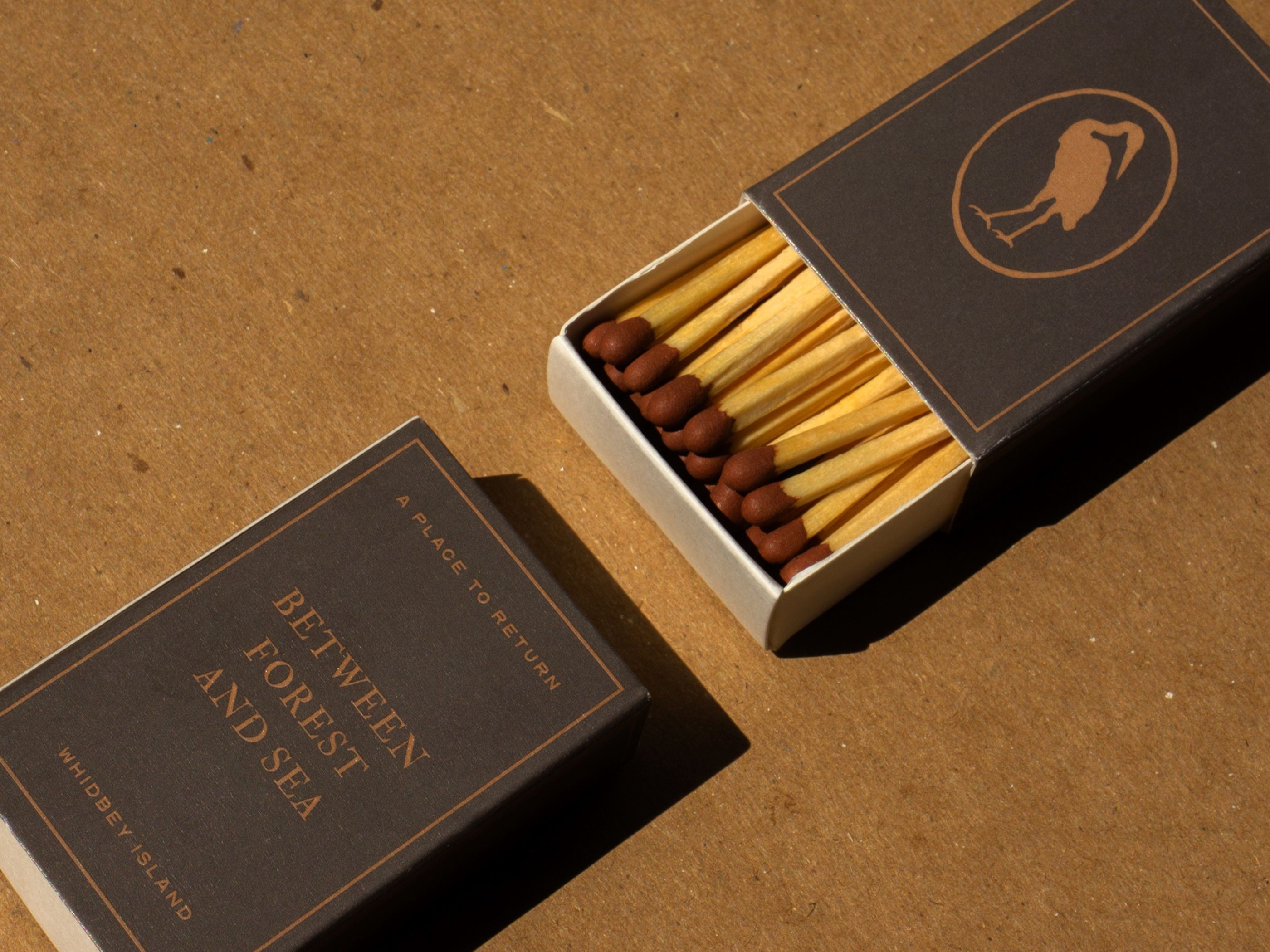
The logotype set reflects the calmness of the island — wide kerning allows the letterforms to breathe, with figures that bridge an organic, loose feeling with a sense for backwoods adventure.

The Great Blue Heron
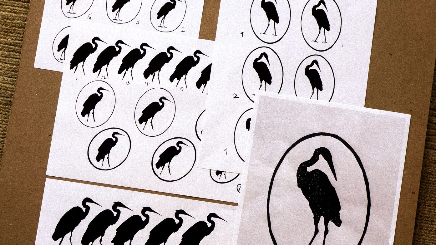
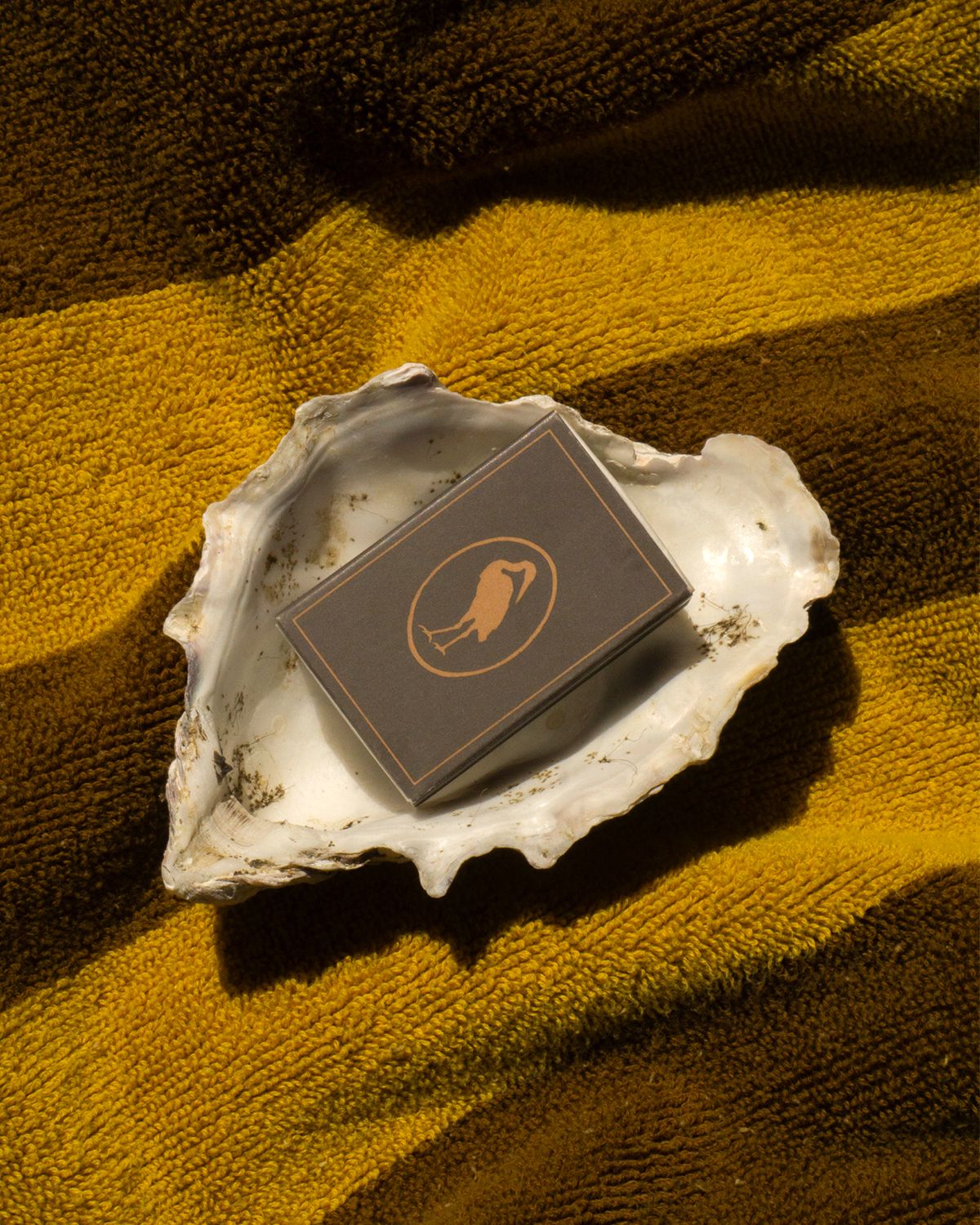
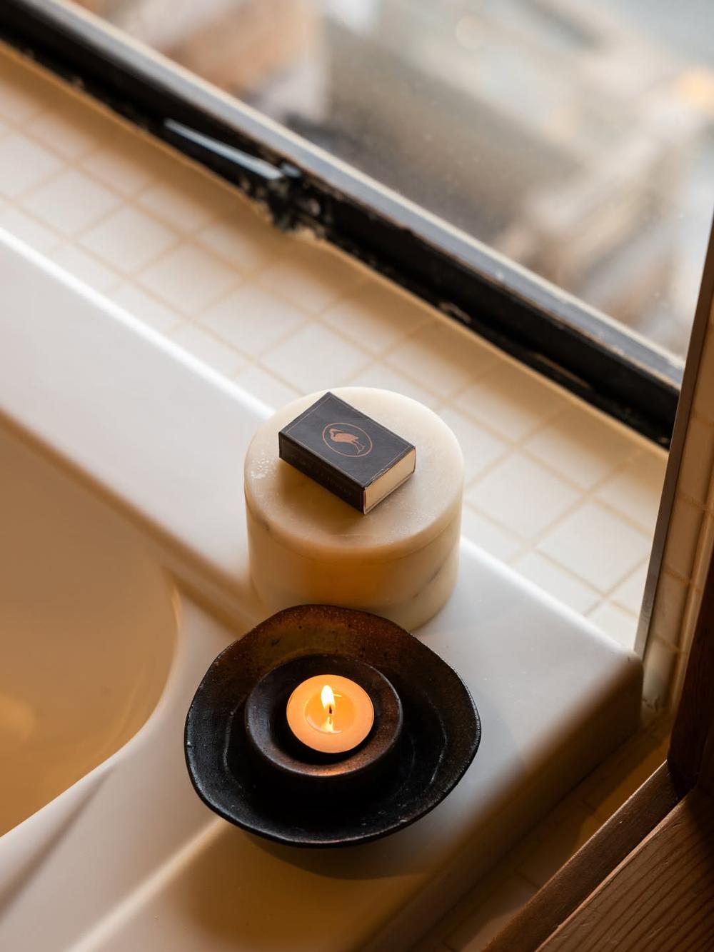
The inn’s primary logo is a bespoke ovular mark that depicts a great blue heron (ardea herodias), a year-round native to the Pacific Northwest and a reflection of the inn’s quiet, reflective place on the waters of the Saratoga Passage.
The heron arrives to the inn having been illustrated, carved into a wood block and printed by Steph Carendi, then scanned and digitized.


Typography and Color Palette
IM Fell and Optician Sans provide a balanced approach, with wide kerning across applications to maintain the inn’s sense for slowing down. The system’s custom arrows emerge from elements of the serif selection.
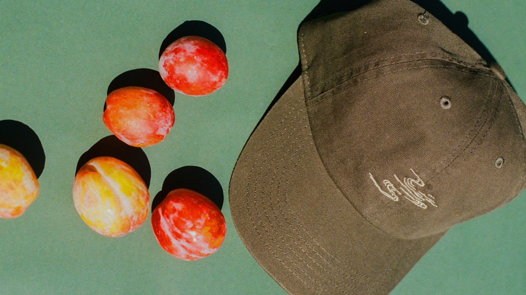
The inn’s color palette is inseparable from the solitude of Whidbey Island. Anchored by two shades of green and a driftwood brown, the system invites a plurality of treatments to create a comprehensive, non-monotonous world on property.

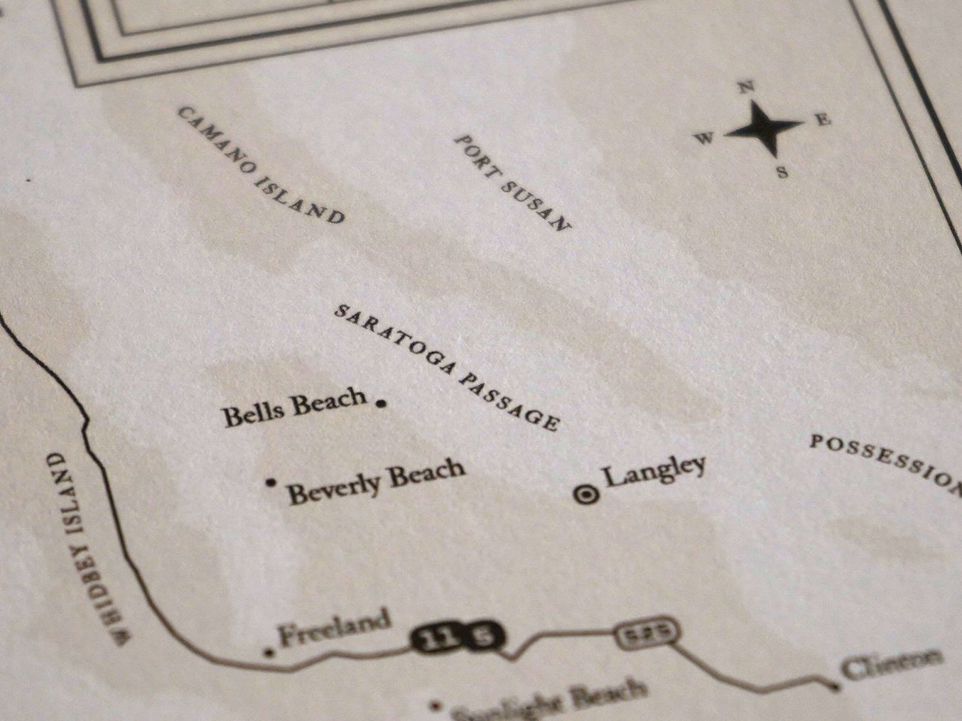
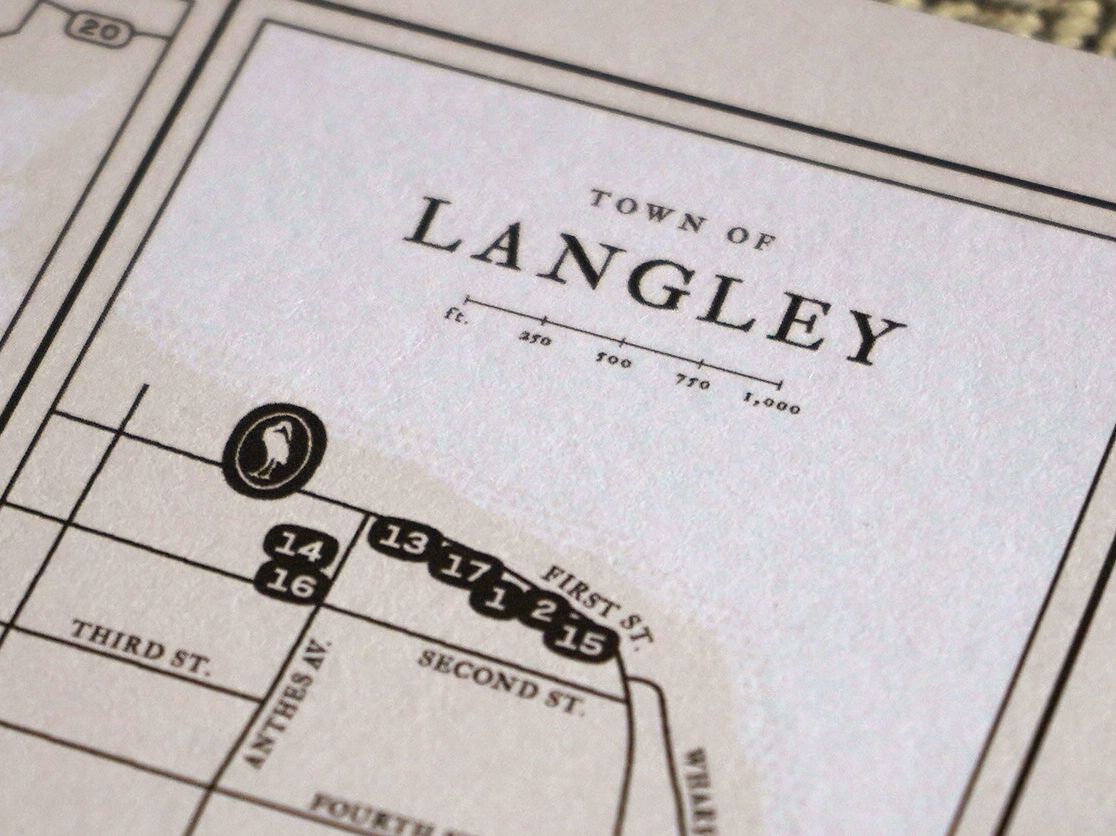
The Spa at Langley
A subset of the inn experience, the spa takes on a matching logotype system but with a palette limited to paper and madrona. Reference to the spa remains casual — “our spa” or “the spa” — when written or in conversation on property.
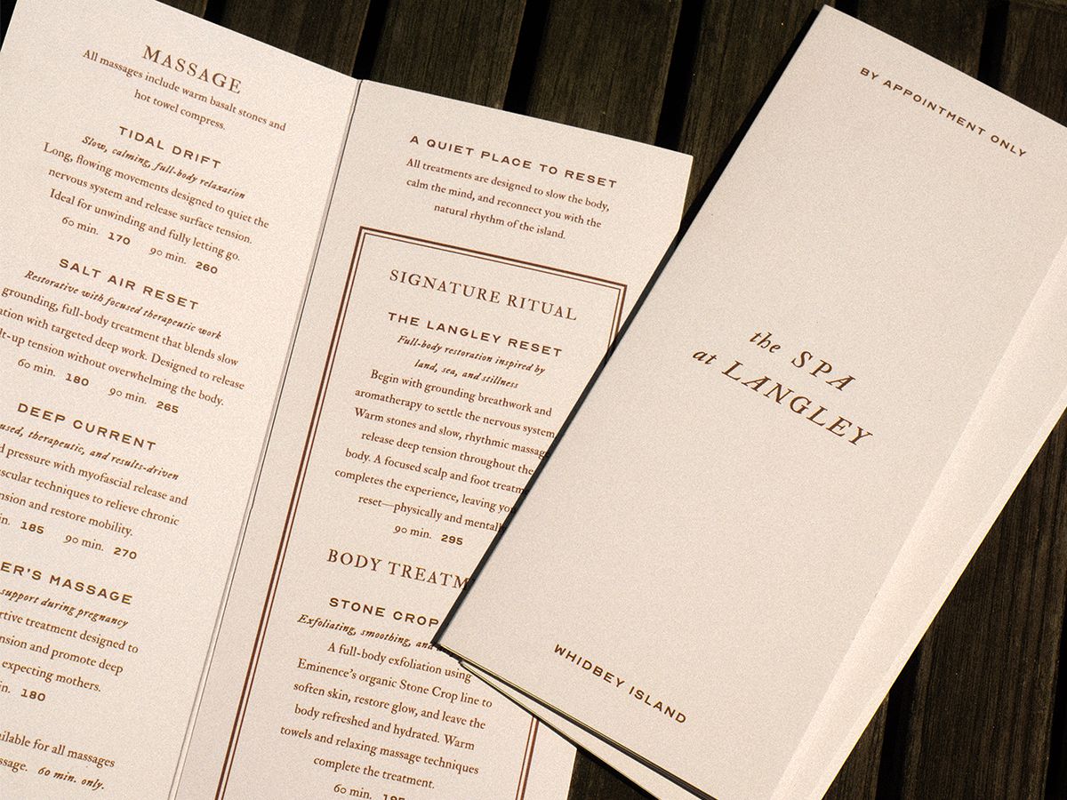

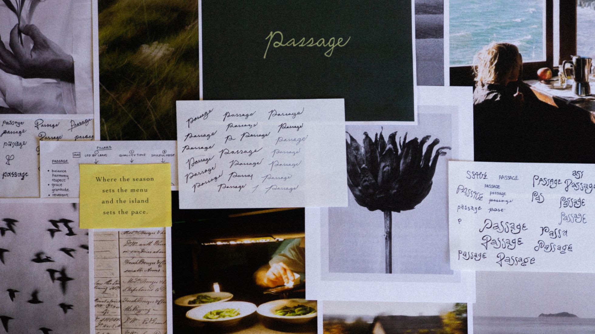
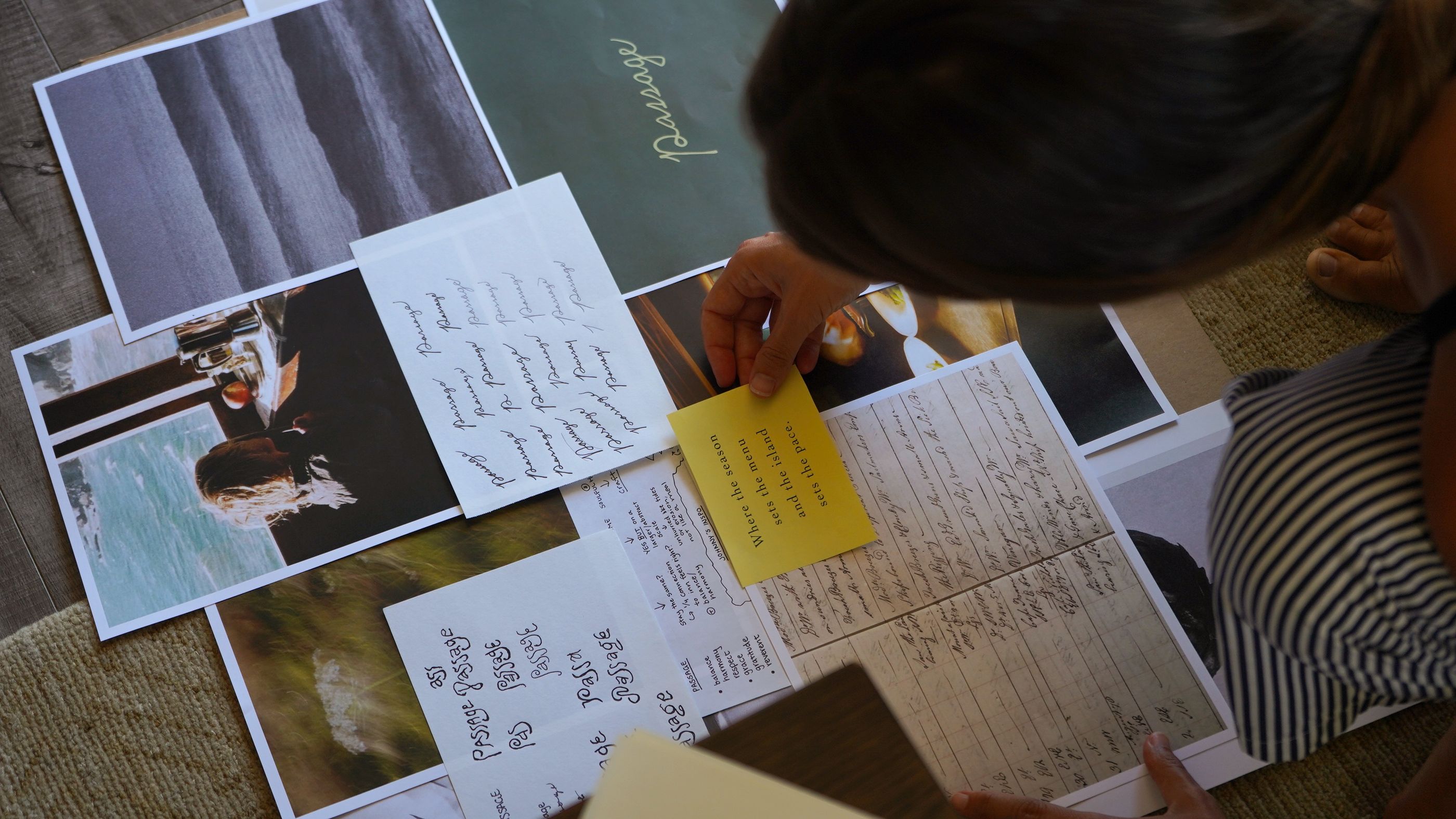
Passage
Where the season sets the menu,
And the island sets the pace.
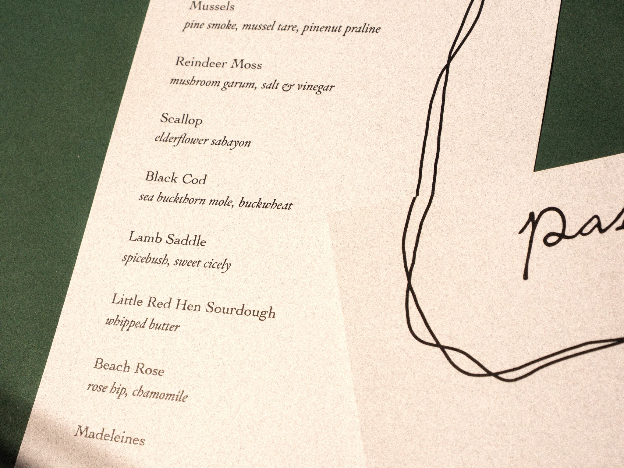
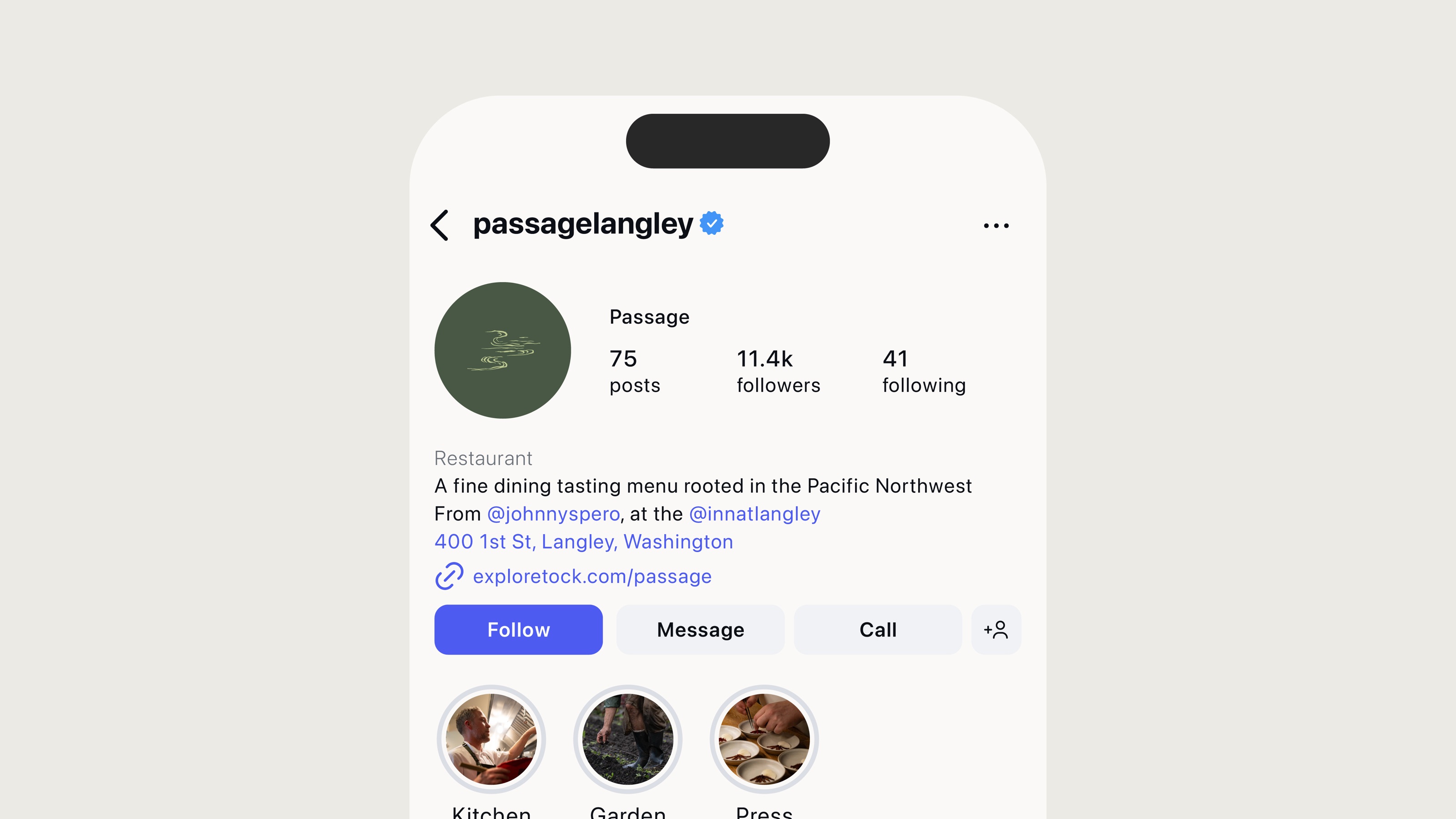
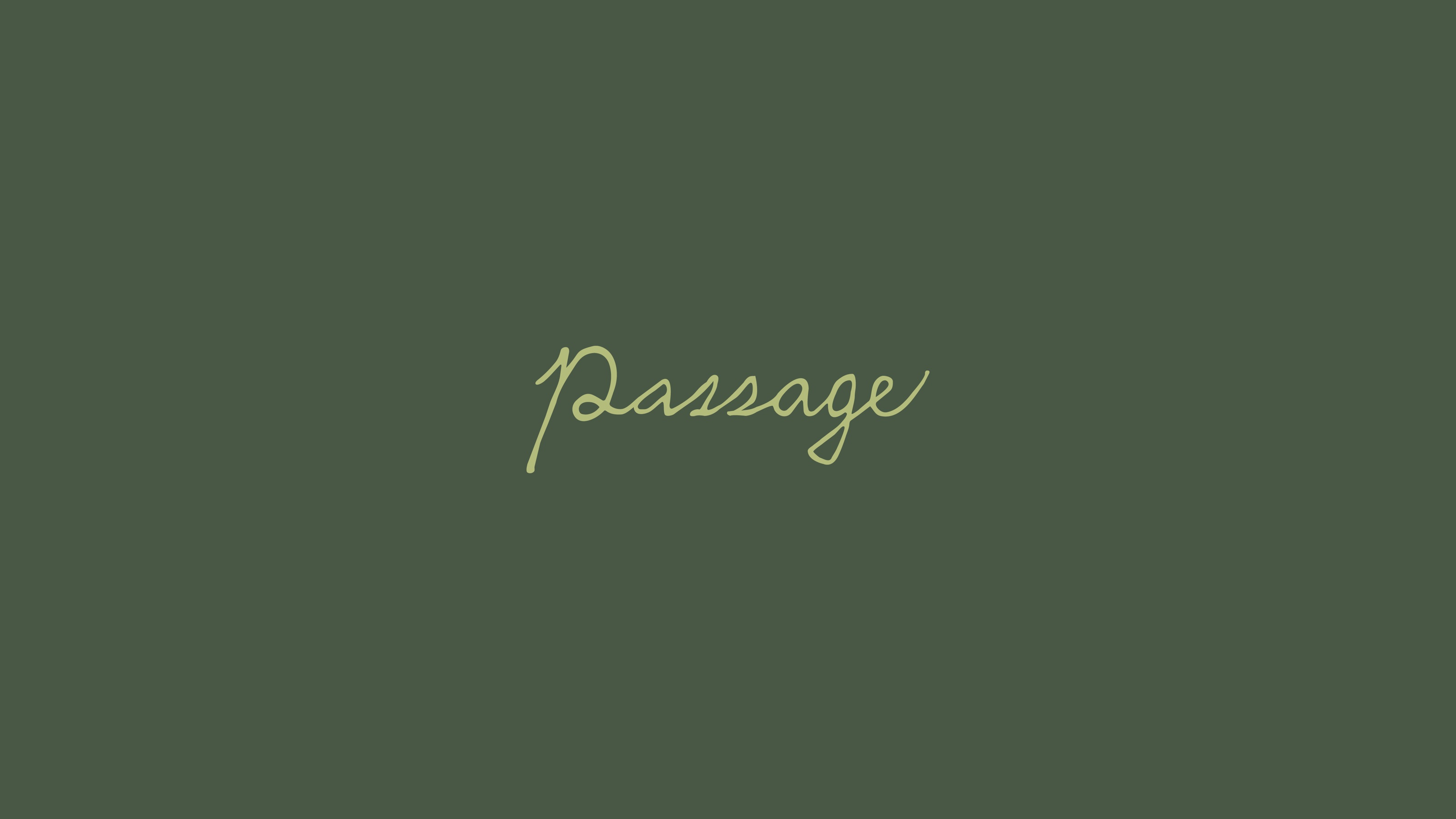
Shaped by the rhythm of the seasons, Passage is a new culinary experience at The Inn at Langley rooted in the abundance of the Pacific Northwest.
Drawing from the forests, waters, and farms of Whidbey Island and the wider Pacific coast, each meal unfolds with quiet intention—an intimate reflection of place, season, and thoughtful sourcing.
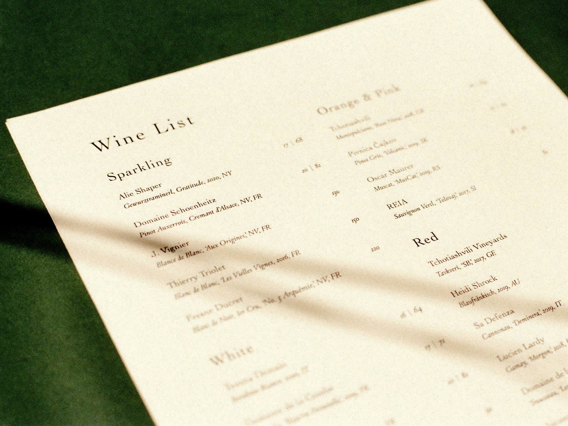
Led by award-winning Executive Chef Johnny Spero, Passage is a multi-course tasting menu service with a la carte beverage offerings and curated pairing options.