
Intera Capital
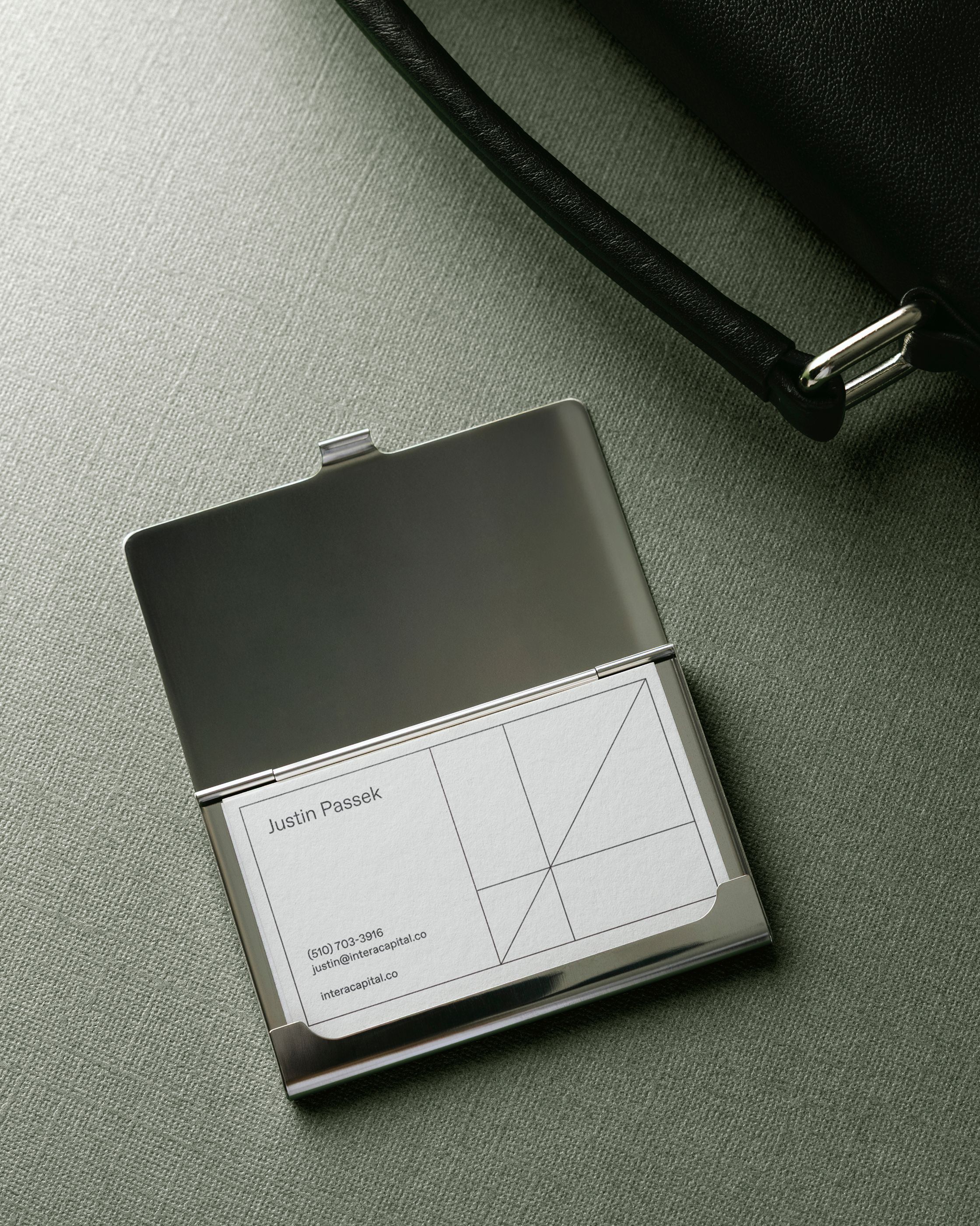
Intera Capital is an investment firm focused on technology and consumer companies that prides itself on being an active partner at each stage of growth, from garnering early traction to leading industry sectors. A new firm, Intera brings together veteran experience across investing, banking, media and entertainment, and emerging technologies. We developed a brand identity that responds to aesthetic gaps in the financial world, with a design system rooted in the beauty of mathematics and situated along the idyllic coast of California.
Services
- Brand Identity
- Art Direction
- Print & Layout
- Copywriting
Collaboration
Holiday Studio
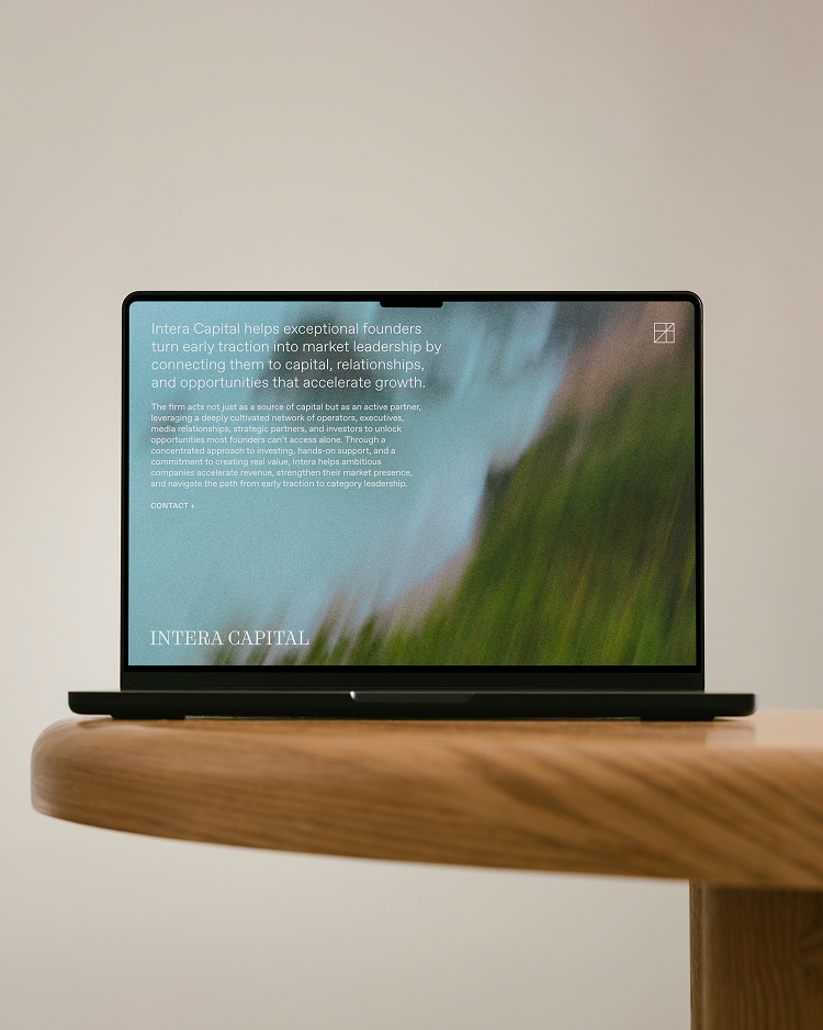

With a primary mark based in Oliver Byrne’s colored diagrams of Euclidean geometry in 1847, Intera’s identity traces a history of cutting-edge representations of mathematical concepts in visual form. The system pairs this sense for clarity with a reverence for the diverse and dramatic natural features along the coastline of the Golden State.
Hover on each image to learn more
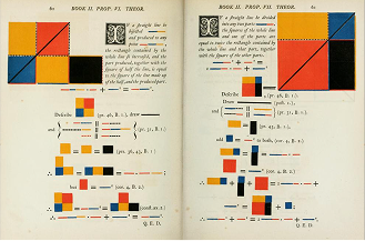


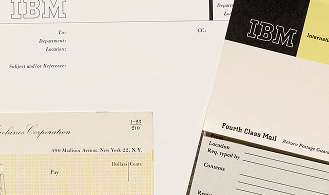



The mark connects the spirit of Euclid’s proofs 6 and 7 from book 2 to Intera’s experience as a conduit between founders and investors, where the firm sits within a clearly defined environment but moves along the diagonal axis to face different challenges to their industry. The resulting system offers flexibility in layout design, especially for dense, data-heavy presentations.




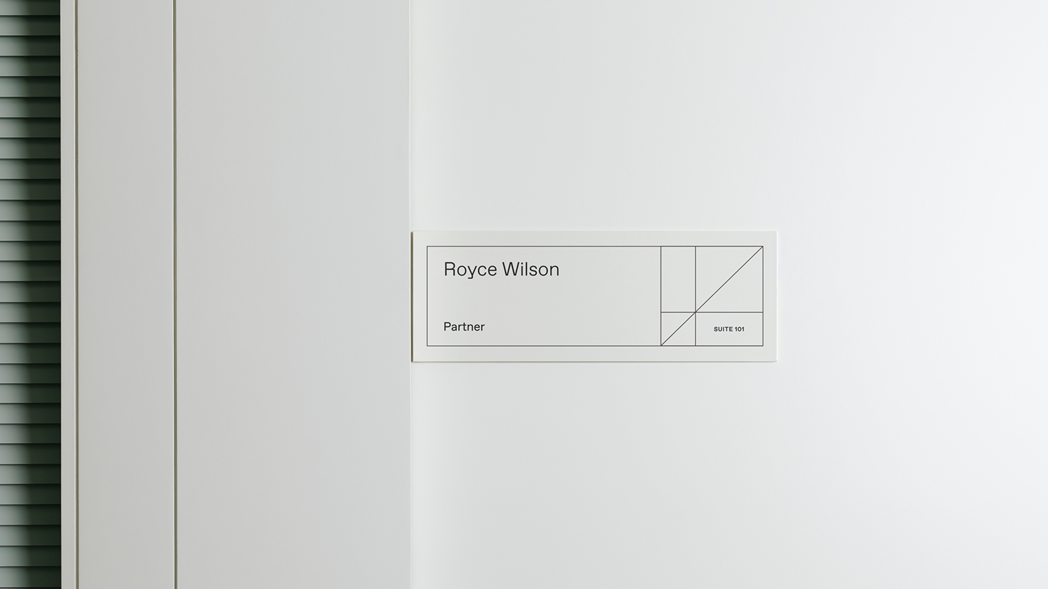


The brand infrastructure features arrow icons drawn directly from the primary mark, which also expands and contracts to create compelling image crops or accommodate variant pieces of data.